On the balance between consistency, creative expression, and building brand systems that leave room for flexibility.

There's a certain irony in the way we build brand guidelines. We spend months developing a distinct identity, defining its personality, establishing its visual language, and articulating what makes it different. Then we package it all into a document that, if we're not careful, makes it incredibly difficult for that brand to do anything unexpected.
Logos have rules. Colors have values. Typography has hierarchy. Photography has treatments. Layouts have grids. Every element is carefully considered, documented, and approved.
And for good reason. Consistency matters. It's how brands build recognition, establish trust, and create a cohesive experience across an increasingly fragmented collection of touchpoints.
But somewhere along the way, consistency can become an end in itself. The guidelines stop being a foundation for creative expression and start becoming a checklist for compliance. Every execution begins to look like the last. Every social post follows the same formula. Every campaign feels like another application of the same template.
The brand is recognizable, certainly. But is it interesting?
I recently came across Starbucks' Creative Expression guidelines, and one particular distinction immediately caught my attention: the separation of functional and expressive applications of the brand.
It's a relatively simple concept, but one that articulates something I think is often missing from the way we approach brand systems.
Not every brand interaction needs to express the brand in the same way.
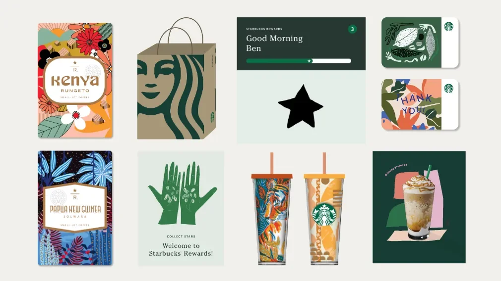
Function has a purpose. So does expression.
Starbucks describes its creative expression as a spectrum, ranging from functional to expressive, with the appropriate balance determined by where the customer encounters the brand.
The distinction is intuitive when you think about it.
A menu doesn't need to be expressive. It needs to be legible. A wayfinding sign doesn't need to demonstrate the full personality of a brand. It needs to help someone find their way. An ordering interface should prioritize clarity and ease of use, not compete for attention with decorative elements.
These are functional applications. Their job is to communicate efficiently, remove friction, and make an experience easier.
But a brand needs more than functional communication to establish an emotional connection.
Consider a seasonal campaign, a social media post, a product launch, or a piece of editorial content. These are opportunities to introduce personality, tell a story, respond to culture, and create moments that are memorable beyond the information being communicated.
This is where expression comes in.
And importantly, expression doesn't mean abandoning the brand. It means interpreting it. Taking the foundational elements of an identity and using them with a little more imagination, depending on the context.
The two aren't competing interests. They're complementary parts of a larger system.
The problem with making everything look like a brand guideline.
I think we've become so accustomed to thinking about brand consistency through the lens of visual repetition that we've lost sight of what we're actually trying to achieve.
A recognizable brand doesn't necessarily need to use the same layout, color combination, image treatment, or typography on every single execution. In fact, when every application looks identical, the identity can become more of a template than a creative language.
This is particularly apparent on social media.
Social platforms are inherently dynamic. They're built around conversation, cultural moments, discovery, and content that feels native to the environment in which it appears. People don't open Instagram or TikTok hoping to see a brand's latest application of its corporate identity.
They want to be entertained, informed, inspired, or occasionally surprised.
Yet brands often approach social content as if they're designing another page in their corporate brochure. The same typography, the same color blocks, the same carefully positioned logo. Every post looks polished and perfectly on-brand, but very little feels spontaneous, relevant, or particularly human.
The irony is that in trying so hard to maintain consistency, brands can inadvertently make themselves less distinctive.
A brand should be recognizable, but it should also be capable of responding to the world around it. It should have enough flexibility to participate in a conversation without every interaction feeling like it was pulled from a pre-approved template.
Guidelines should create possibility, not just restriction.
I don't think the answer is to abandon brand guidelines or give creative teams unlimited freedom. A strong identity needs structure. Without it, expression can quickly become inconsistency, and a brand can lose the very recognition it worked so hard to establish.
But I do think we need to be more intentional about what we're asking guidelines to accomplish.
The best brand systems establish what is essential and where there is room to explore. They define the elements that make a brand recognizable while giving creative teams the freedom to interpret those elements in different ways.
That might mean a consistent typographic foundation with room for more expressive treatments. A recognizable color palette that allows for seasonal variation. A photography direction that establishes a visual sensibility without prescribing the exact same composition every time.
The point isn't that anything goes. It's that not everything needs to be predetermined.
And this distinction matters beyond the design team. Brand guidelines are used by marketers, social media managers, content creators, agencies, production partners, and people who may not have been involved in building the identity in the first place. A system that only tells people what not to do can quickly become a barrier to good creative work.
A system that communicates the intent behind the rules gives people something much more valuable: the ability to make informed creative decisions.
A brand should be allowed to evolve.
Ultimately, I think we need to move away from the idea that brand consistency means making everything look the same.
A brand is not a static collection of visual assets. It's a living identity that exists across different environments, audiences, platforms, and moments in time. It needs to be dependable enough to be recognized, but flexible enough to remain relevant.
The goal isn't to make every touchpoint look identical. It's to make every touchpoint feel like it belongs to the same brand.
That requires more than a well-designed logo or a carefully documented set of rules. It requires a clear point of view, a thoughtful creative foundation, and enough room for the people bringing the brand to life to actually do what they do best.
Because a brand that can't express itself is just an identity system.
And a brand should be allowed to have a personality.